
AI-Generated Dashboards: Visual Analytics from Chat
Ask your AI about pipeline data and get a real dashboard. Not text. Not a description. An actual interactive visualization you can click, filter, and explore.

One Dashboard, Eight Ways to Explore Your Data
Type "show me Affinity Insights" and the AI opens a unified dashboard right in your Studio interface. It starts with a navigation grid—eight tiles laid out in a 4x2 grid, each one a different view into your CRM data.
At the top, you see three stats: total lists, notes created in the last 30 days, and stale entries. Then below that, the question: "What would you like to explore?"
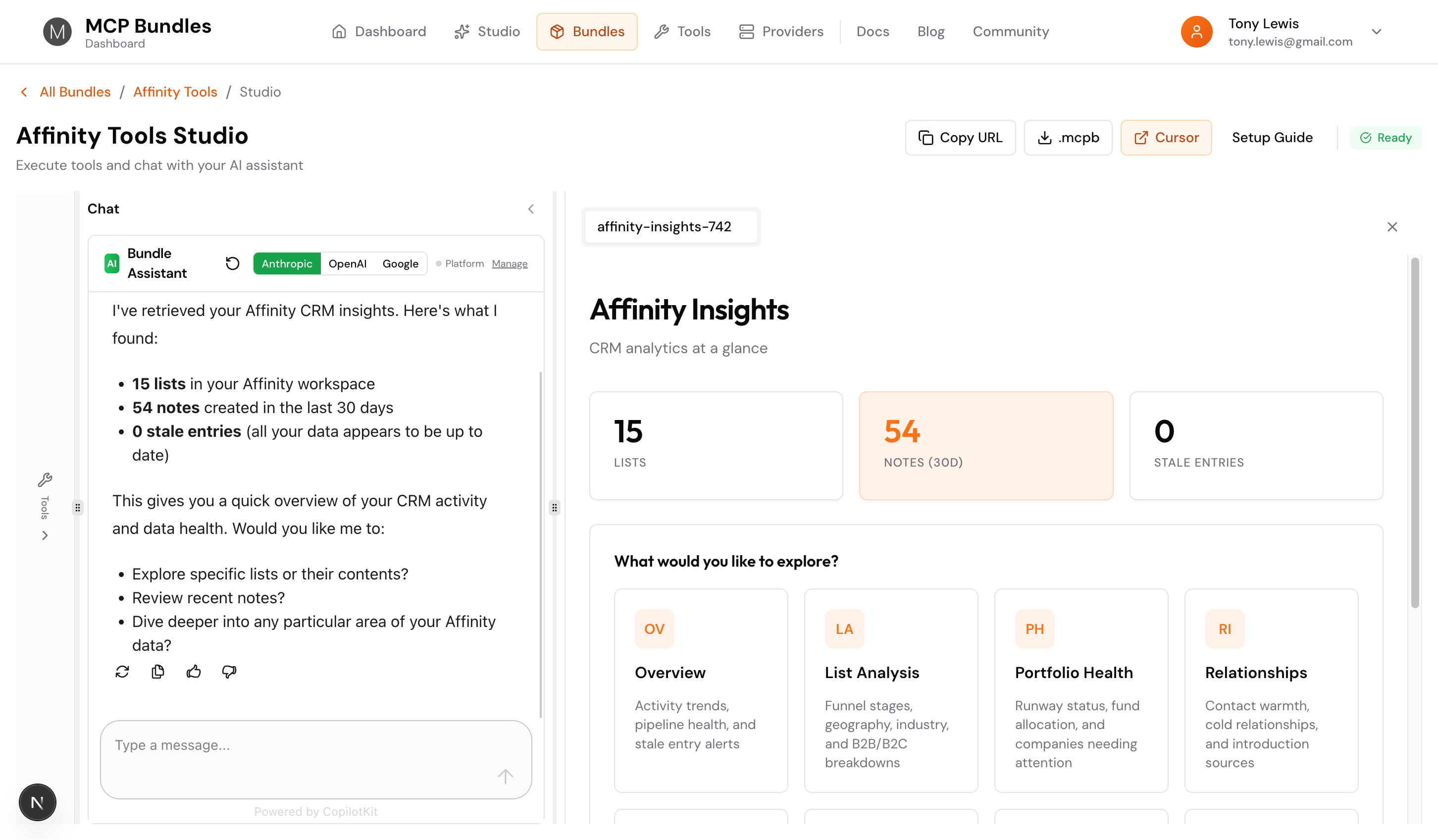
Each tile has an icon, a title, and a short description. Click one and you're in that view. No page reload, no waiting—it's instant.
What's Inside Affinity Insights
We built one unified dashboard that covers pretty much everything you'd want to know about your Affinity CRM:
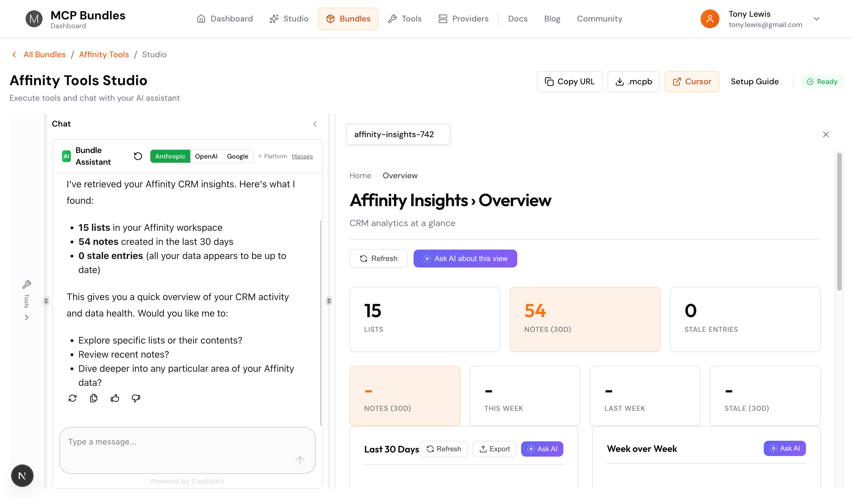
Overview
Activity trends plus pipeline health in one place. See notes over the last 30 days, week-over-week comparisons, recent activity, and stale entries that need attention. It's your CRM pulse check.
The view shows activity charts, recent notes, lists overview, and stale entries—all with Export and Ask AI buttons on each section.
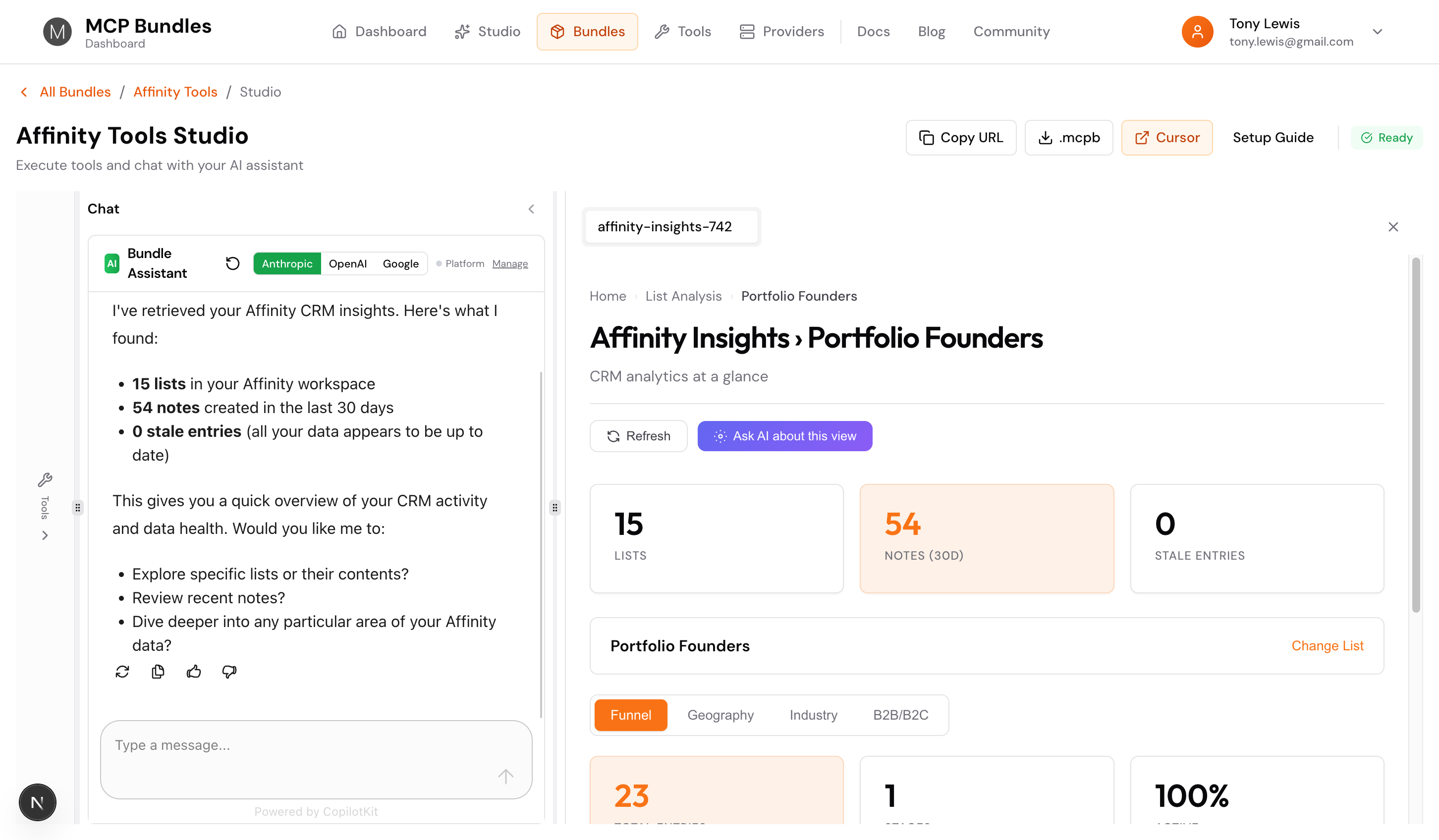
List Analysis
Pick any list and analyze it four ways. The view starts with a list picker, then once you select a list, you get sub-tabs at the top:
- Funnel: Stage distribution, conversion rates, bottlenecks. Shows total entries, number of stages, and the top stage percentage.
- Geography: Country breakdown, top cities, location mapping
- Industry: Sector concentration, diversification opportunities
- B2B/B2C: Client focus and business model breakdowns
Switch between tabs instantly. Same list, different angles. The breadcrumbs show "Home › List Analysis › [Your List Name]" so you always know where you are.
Portfolio Health
For VCs and investors. Track runway status, fund allocation, and companies that need immediate attention. See which portfolio companies are healthy (12+ months runway) versus critical (<6 months). It auto-detects your status fields, so it works even if your schema's custom.
Relationships
Track relationship warmth. See who's warm (<30 days since contact), cooling (30-60 days), or cold (60+ days). Find your top introduction sources and get a list of cold relationships that need outreach. Perfect for keeping your network active.
Funding Analysis
Investment stage distribution, average funding amounts, top co-investors, and funding distribution buckets. See where your pipeline companies are in their funding journey and who else is investing alongside you.
Demographics
Company age, headcount distribution, founding year trends. Understand the makeup of your pipeline—are you targeting early-stage startups or established companies? The charts show you.
LP Pipeline
Fundraising funnel for LPs. See estimated commitments, check sizes, active pitching status, and LP geography. Track where you are in conversations and prioritize your outreach.
Data Quality
Measure CRM completeness. Company quality scores, contact quality scores, common missing fields, and records that need attention. See overall data health at a glance.
It's Actually Interactive
Every view responds to what you do:
- List pickers switch between pipelines instantly—click "Change List" and pick a different one
- Refresh buttons pull the latest data from your CRM
- Export buttons download CSV files with one click
- Ask AI buttons let you query the data you're looking at—click it and ask "what patterns do you see?"
- Sub-tabs in List Analysis switch views without reloading—Funnel to Geography to Industry in seconds
- Breadcrumbs help you navigate back—click "Home" to return to the navigation grid
The AI creates a working app, not a screenshot. You can explore, filter, and dig deeper.
How It Works in Studio
When you run the Affinity Insights tool in Studio, it opens in a tab panel. The dashboard renders in a sandboxed iframe, but it feels native. You see the full dashboard with all its interactive elements.
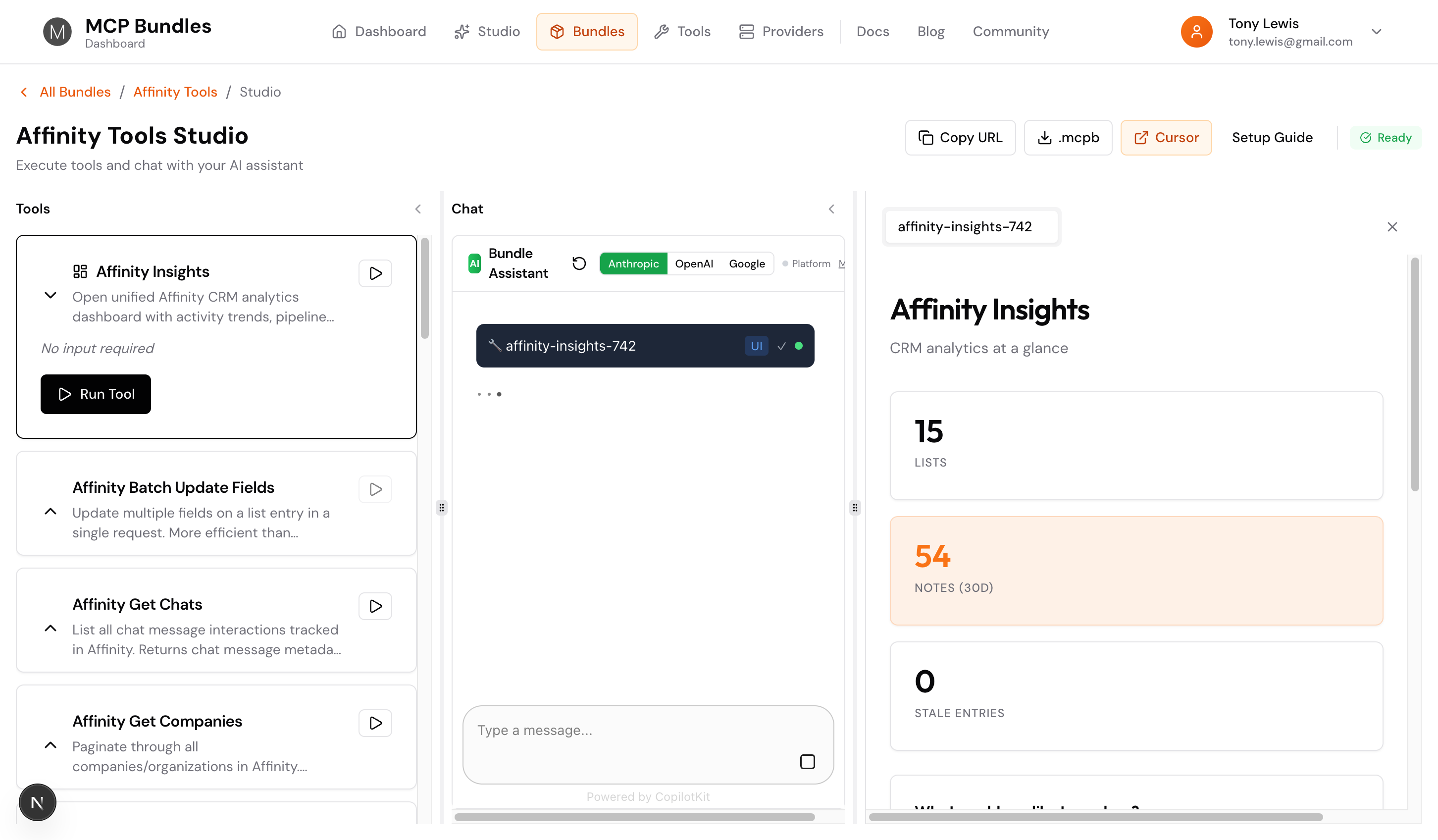
The tool shows a "UI" badge and a checkmark when it's done loading. Click into the output tab and there's your dashboard, ready to explore.
Built on MCP Apps
These dashboards use the MCP Apps protocol (SEP-1865). The AI generates HTML that runs in a sandboxed iframe, communicating back to your data through standard MCP tool calls.
Your data stays secure. Every request is logged and auditable. The dashboard can only access what your MCP tools allow.
Smart Field Detection
Here's something cool: the dashboard auto-detects your fields. Don't have a field called "affinity-data-industry"? It'll find your industry field anyway by looking for dropdown fields with industry-related names. Same for location, funding stages, runway status—it figures it out.
This means it works with custom schemas, Dealroom enrichment, or whatever field setup you've got. No configuration needed.
Available Now
If you're using MCPBundles with Affinity, just ask:
- "Show me Affinity Insights"
- "Open the portfolio health view"
- "Analyze my relationships"
- "Check data quality"
- "Show me the LP pipeline"
The AI opens the unified dashboard, and you pick what to explore. Or ask it to go straight to a specific view—it knows where everything is.
Once you're in a view, use the Ask AI button to dig deeper. "What patterns do you see in this funnel?" or "Which companies need attention?" The AI has context about what you're looking at.
Want dashboards for your data? MCPBundles brings AI-generated visualizations to hundreds of integrations.